Android Auto’s new user interface is rolling out in India: Here’s what it’s like to use
[ad_1]
One of the team members at the Times of India-Gadgets Now spotted the new UI of Android Auto. Here’s a first person account of how the new UI is different from the older one.
New Cards
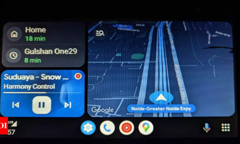
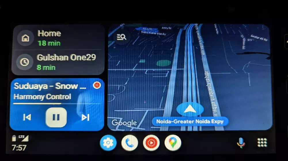
Unlike the older Android Auto interface, the new one gets a card-based UI. By default, the screen gets three cards: the largest one is dedicated to, of course, Maps (for navigation). This card takes about 60% of the space, while the other two, which in our case were search bar (to type in destination) and music (YouTube Music) cards, are fitted in the rest of the screen space. There is a card-based design in line with the company’s Material You scheme. The media card shows album art.
The “menu” button is shifted towards the drivers’ side and there are shortcuts for “settings”, “phone”, “Maps” and “YouTube Music” in the quick launcher. The launcher shows recently-used apps.
Instead of showing up on the top left, the time and battery of the connected smartphone now show up on the bottom right corner.
Google said that Android Auto is compatible with all major car makers and the split screen layout is also adaptable to different screen sizes. This means that the new UI will be available for cars that have both larger and smaller screen sizes than ours.
Google Assistant
In addition to the new design, Google Assistant also gets new capabilities. The virtual smart assistant provides smart suggestions, including missed call reminders and instant access to music or podcasts.
Smart suggestions is a handy feature but it is recommended to use it in case of extreme needs because you still need to read the smart suggestion that moves your attention from the road to the screen.
The “mic” icon is placed just beside the “menu” button and is now more reachable. If you don’t want to have three cards, you can remove one of them and drive with a cleaner user interface.
The new design also offers a seekable progress bar for music and podcasts that allows users to skip ahead in a song or episode. You can also make WhatsApp calls now and check messages that are received during a particular trip.
[ad_2]
Source link